Telling Data Driven Stories
Presentation on tools for data exploration, data analysis, and data presentation for data driven storytelling
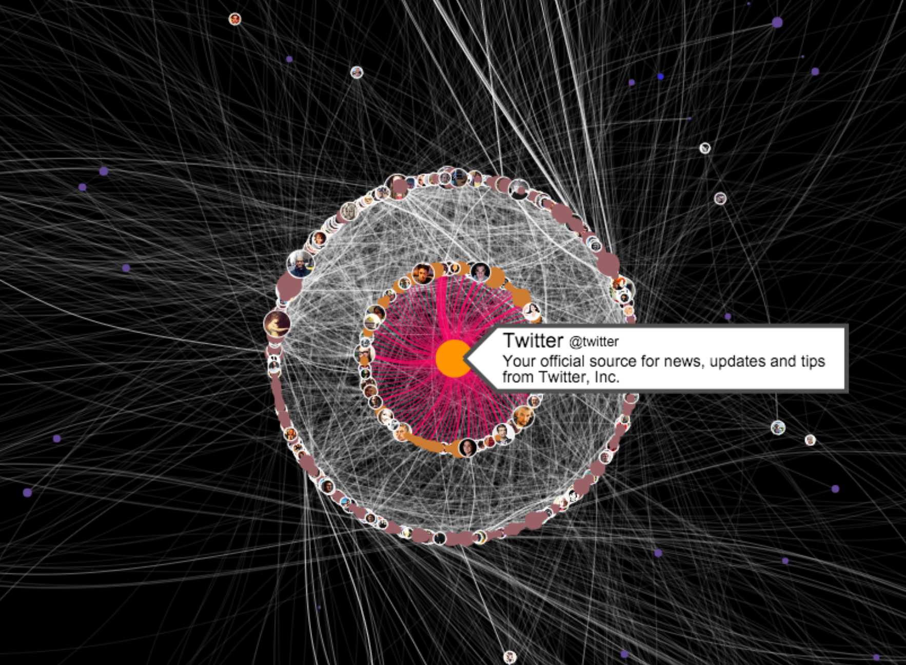
Tweet
Ben Heubl, for Warwick University

Thanks for attending this presentation. I might already bore you by telling you that data is becoming ubiquitous. "Big news", you might say. Or "even now my wristband seems to know more than I do". Whatever it is, let's explore what possibilities we have to use data for stories.
In fact, I could be you some time ago. Initially, I was just interested in stories that have some sort of data aspect. 12 months later, I find myself as a data journalist. If you don't know what a data journalist is, don't blame yourself. Even many top journalists that I spoke to don't know what I exactly do (but hopefully will soon know).
In short, it essentially involves four areas of expertise. One is analysis, second is visualization (and design), third is, well, data and lastly there is the web. Eventually you might want to bring everything together and write some lines of text about why this insight is interesting, what’s the takeaway (the lesson) and so on. A bit of humor does not harm anyone either. There you have it. Are you excited? Here are seven examples that may help to break the ice:
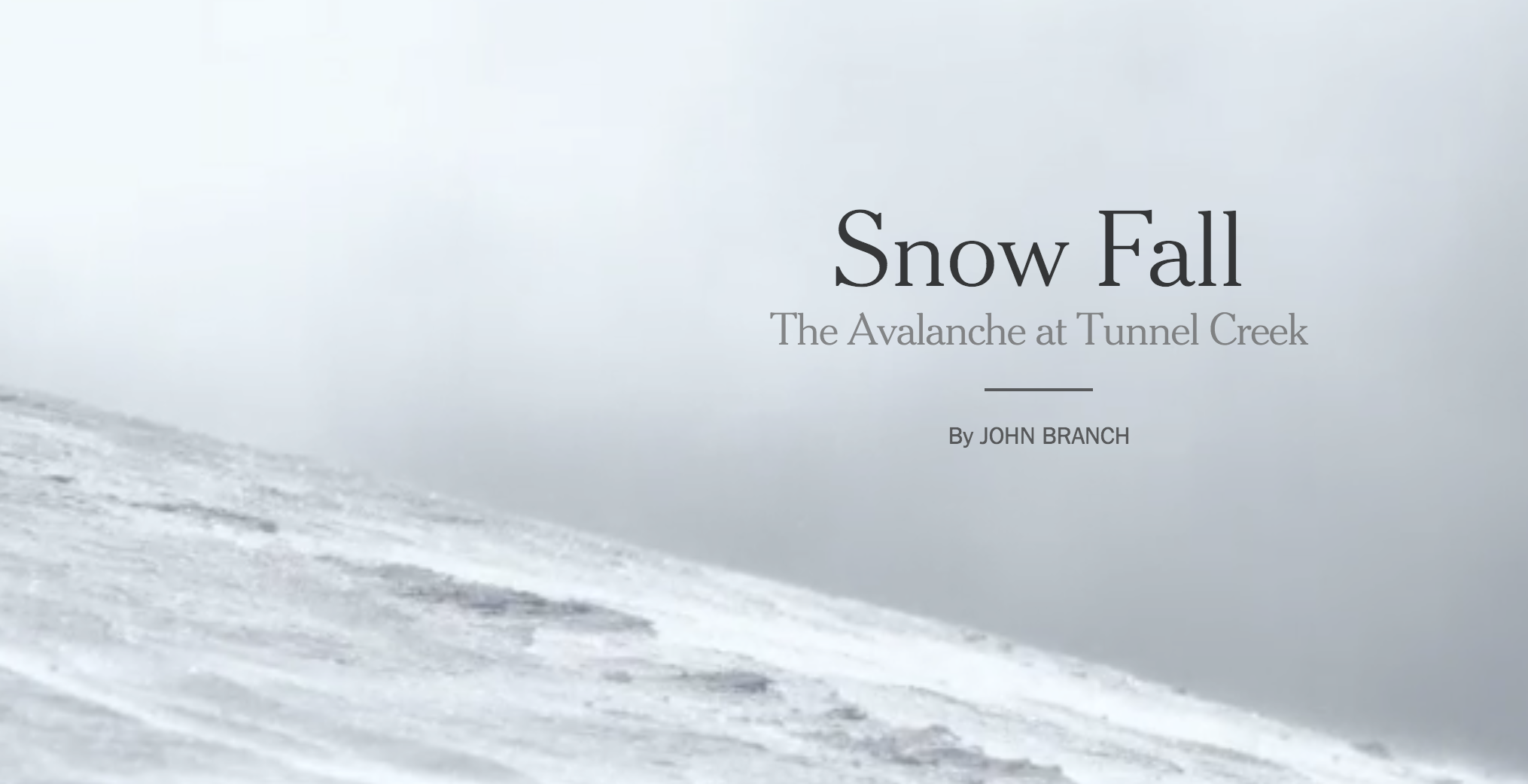
This was one of the starting points, I feel at least, when interactive data driven story telling became the standard. Here is a whole review about the work on Snowfall.
"... an exemplary piece of multimedia journalism, and its many moving (and swooping and clicking) pieces have attracted intense attention from media commentators, but Snow Fall began life not as a demonstration of technology and design capabilities, but with a traditional, in-depth piece by Times reporter John Branch."
The Data Viz
The Background
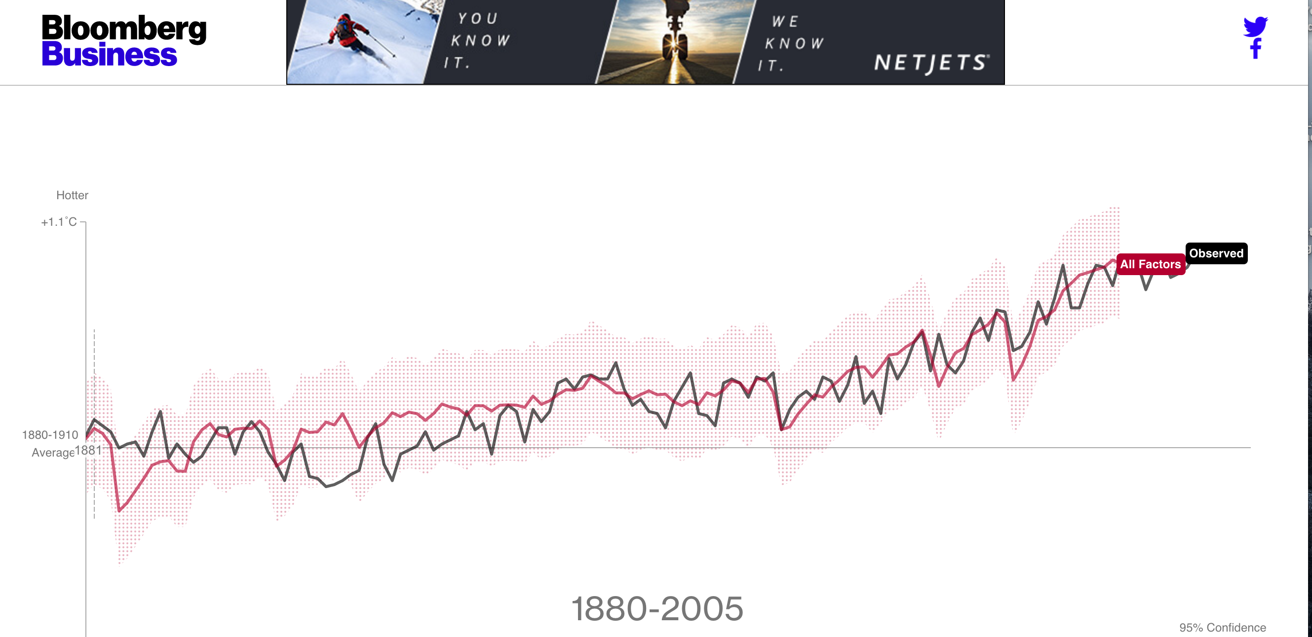
The black "observed" line is the GISS global land and ocean temperature record. It starts in 1880. The colored temperature lines are the modeled estimates that each climate factor contributes to the overall temperature. Each factor was simulated five times, with different initial conditions; each slide here shows the average of five runs. GISS researchers laid out their historical simulations in detail last year in this article. The modeled years 1850-1879 from the Phase-5 "historical" experiment are not shown because the observed data begins in 1880.
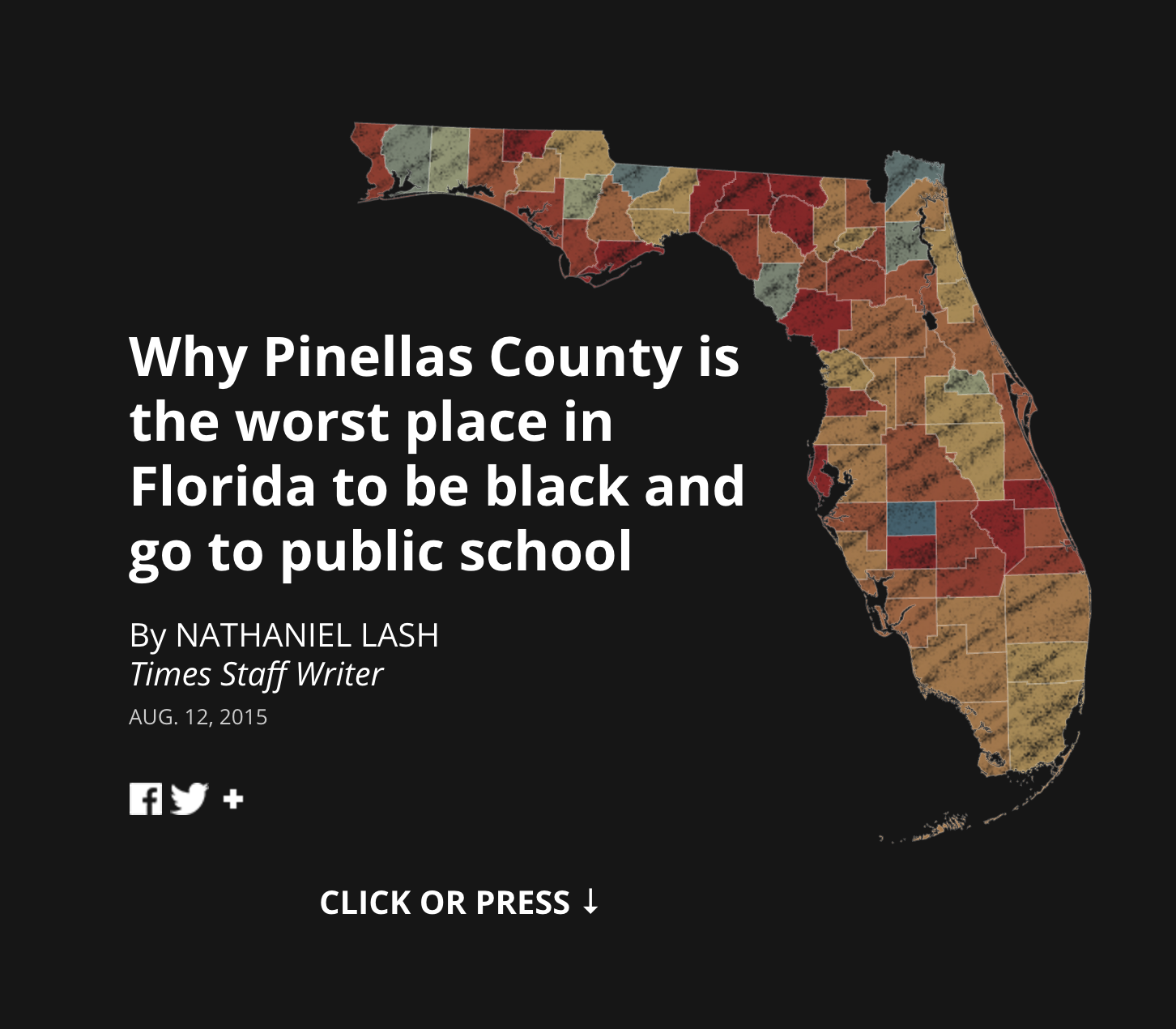
"In just eight years, Pinellas County School Board members turned five schools in the county’s black neighborhoods into some of the worst in Florida. Today thousands of children are paying the price, a Tampa Bay Times investigation has found."
Tampabay Project
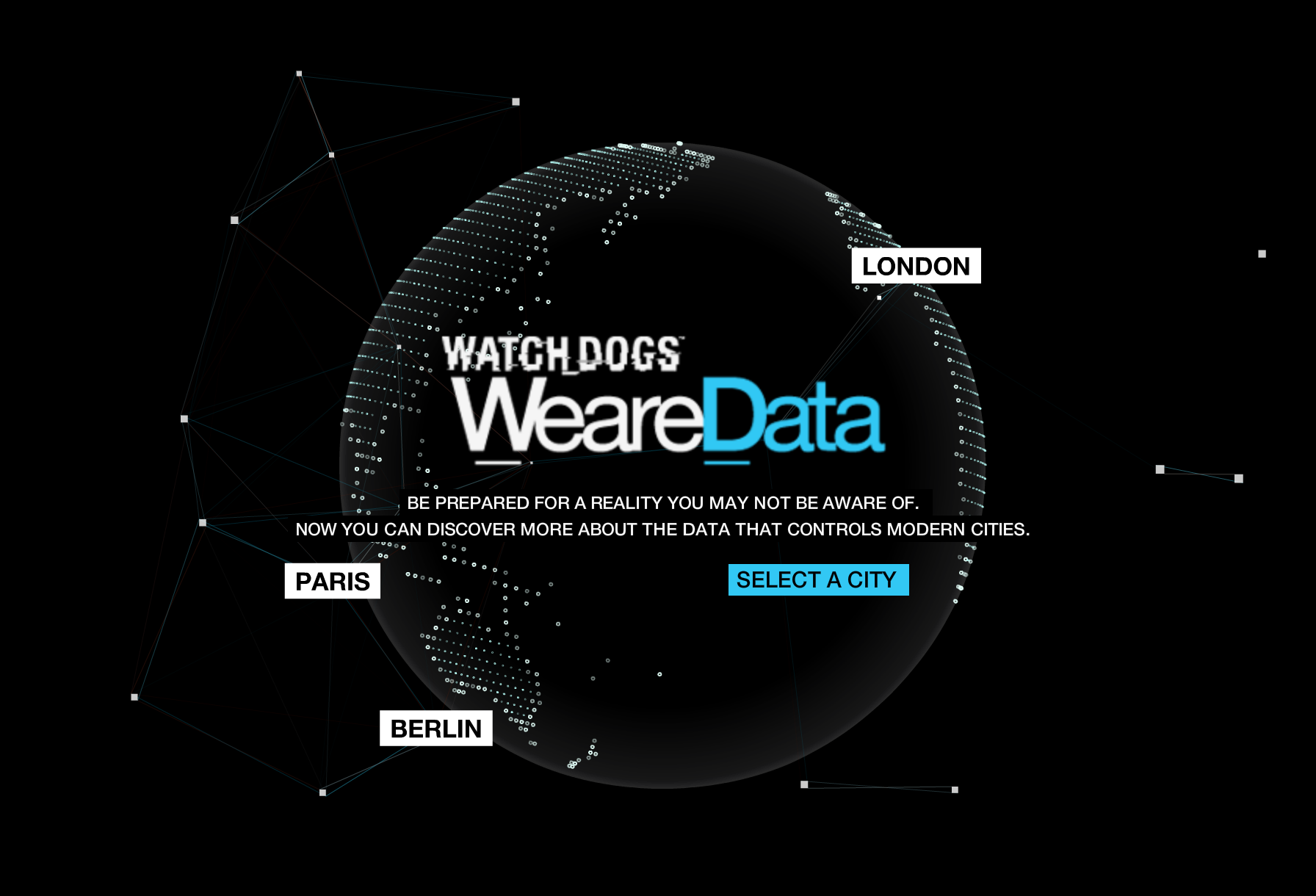
For me as a growing data journalist, the application the website presents is an impressive example how smart cities could offer their population personalised news and updates. But its also an example how to structure the UX/UI for a visualisation that most, if not all get it.
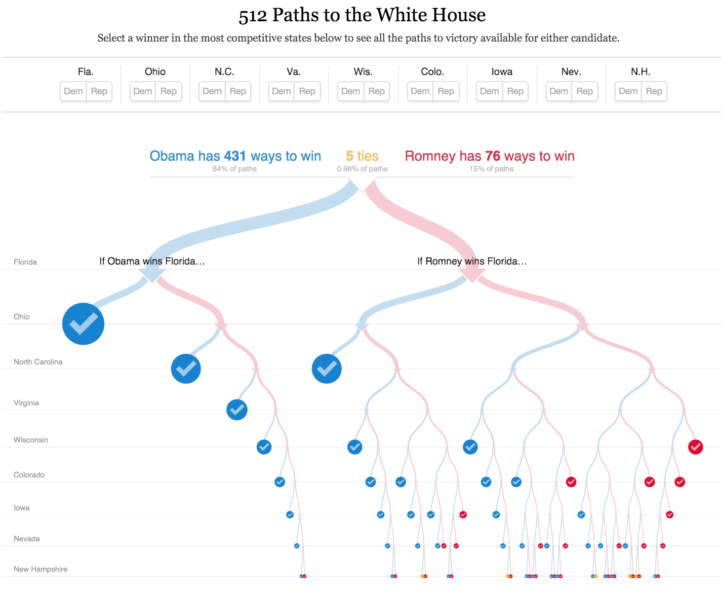
Produced by MIKE BOSTOCK and SHAN CARTER, this simple visualization offered much more to the reader, it helped people to calculate chances.
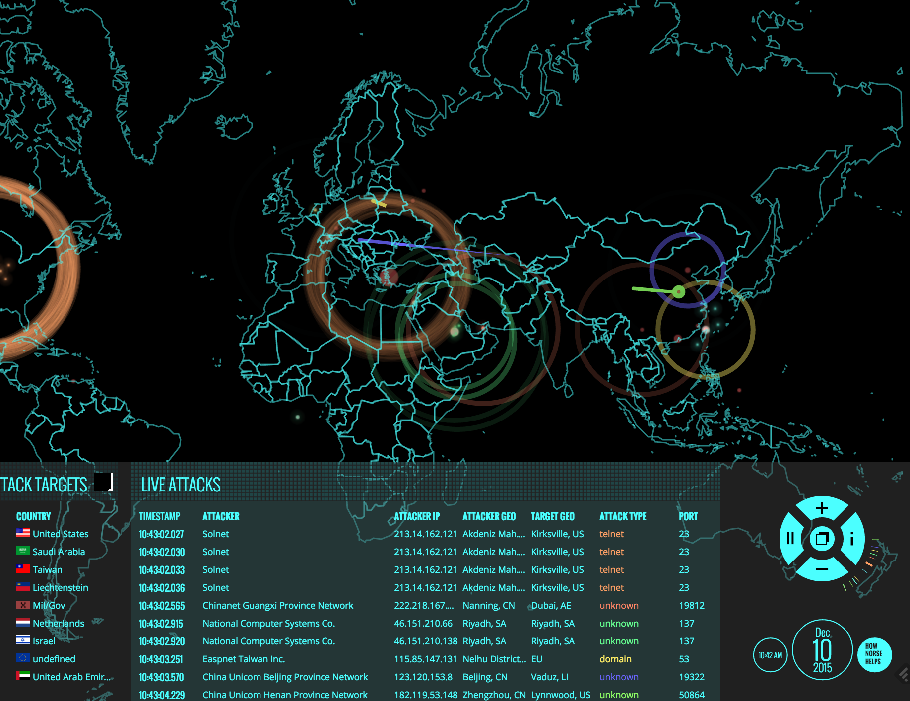
A mesmerizing example of data visualization by computer security firm Norse lets you see penetration attempts in real time, via a DEFCON-esque map that feels like it was ripped right from the old WarGames movie.
But now for the really scary part: This map reveals only the tiniest possible tip of the hack-attack iceberg—penetration attempts against a subset of Norse's network of "honeypot" traps alone. The actual number of hack attempts lighting up the web at any given moment is far, far greater than this nifty experiment can ever possibly show.
For this presentation, I thought it might help anyone interested in telling data stories to go through my personal toolbox which I inherited (from some awesome open source wizards). Instead of just talking about why working with data is worthwhile for storytelling, I thought to myself that we go through the toolbox one by one. Many of the examples have tutorials, Github files and instructions (prepared specifically for this occasion). I leave it to you what to pick.
Goal is to tell some tricks and tips that helped me to get stated. If this is already making your eyes sleepy, then I invite you to get a quick espresso. Data can be boring, but doesn't have to be if there is a playful and creative process involved, and an awesome end product.
A word of warning: I am not calling myself an expert, far from it in fact. I am thinking about data stories probably as much as you do. So if you see mistakes/errors or false claims, let me know. That is the good part about open source movements like this, we are all developing this together.